A mobile learning app for product managers. Flashcards, real
product stories, practice reps, and forward-looking PM signals —
built around one idea: PMs don’t need more content, they need
better judgment.
Live on the App Store and Google Play.
↳
Build 9 shipped to both stores. Still slightly amazed.
Six small modules. One core loop: discover a concept, understand
it quickly, connect it to a real example, practice the thinking,
return often enough to build instinct.
↳ every module is one idea, not a kitchen sink.
easier to flip through on a phone — try it →
Chapter 02 · don’t take my word for it
Try a real flashcard
This is a working version of one card from the app. Tap to flip.
Same content, same structure, same product thinking.
PRIORITIZATION & ROADMAPPING⚡
What is the Impact vs. Effort Matrix and when is it most useful?
👆 Tap card to reveal1 / 108
PRIORITIZATION & ROADMAPPING
WHAT
An Impact vs. Effort Matrix plots ideas by expected user or business value against the work required to deliver them.
WHY IT MATTERS
It quickly exposes quick wins, big bets, distractions, and time-wasters. Use it when teams need fast alignment, not perfect math.
REAL-WORLD EXAMPLE
A team ships a quick copy fix that clears up checkout confusion before committing to a multi-month redesign with uncertain payoff. Sequence the easy win first.
↳ this exact card lives in the app.
The full deck has 108 of them, across 9 categories.
tap or pull down to flip — closer to the real thing than on a laptop.
Chapter 03 · the app, in real screens
Real screenshots from build 9
Captured from the device, not a mockup. Three deep-dive screens —
the kind of secondary states the module grid couldn’t show.
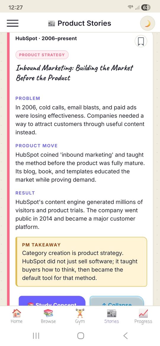
Stories · inside one decision.
The PROBLEM → MOVE → RESULT → TAKEAWAY structure unfolds vertically so the story reads like a memo, not a card.
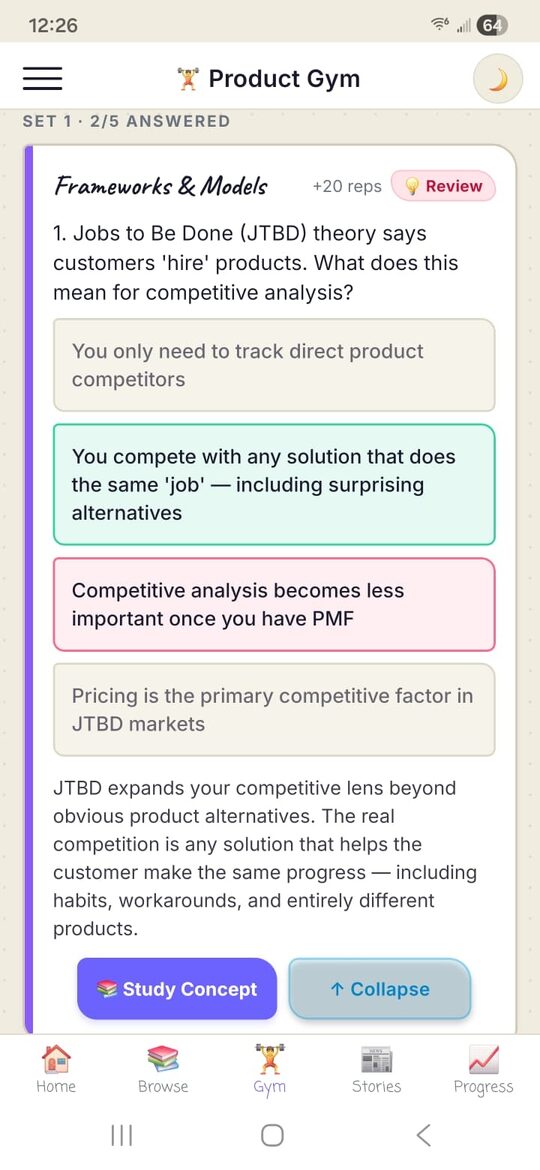
Gym · mid-question.
Five reps per set. Progress dots up top so the visitor knows the end is close — quiz fatigue was the thing this had to design around.
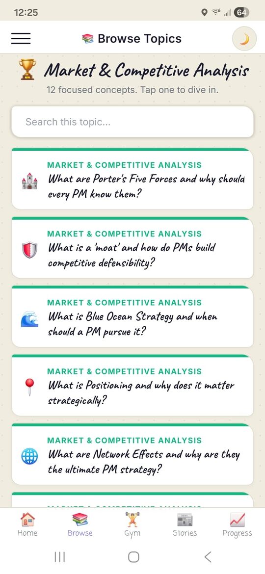
Browse · inside a category.
Every concept in one place, color-coded for muscle memory. This is the screen visitors keep open while they’re actually studying.
swipe for more screens →
Chapter 04 · how a product person became a one-person studio
Built solo, with AI as the team, in
12 weeks
I work in product. Building this meant wearing every other hat too:
design, UX, engineering, QA, and plenty of “wait, why did that
break?” moments. AI became the rest of the team.
The tooling journey
The testing rig
↳ own QA budget. own bug list.
own 11 PM Sunday.
↳ A few of the visible milestones.
There were many more in between — the build that finally went to
review is build 9.
BUILD 9 · the one that shipped
What the work actually looked like
This wasn’t writing code. It was conversations — plain English,
repeated until the AI got it right.
“Okay, so here are both the screenshots, right? I mean, look at
the real estate spacing above the bottom nav bar on the Samsung
and the iPhone 16 Pro Max. You tell me, is this acceptable? But
here’s the important thing — I don’t want us to break everything
else and redo the entire format. At the end of the day, this is
the home screen. I want it to be pleasing on the eye.”
→ resulted in: the home flashcard layout, post-Build 4f
“I come to the flashcard screen and after maybe three, four,
five seconds the card automatically expands. The bottom nav bar
disappears too. Why? On the homepage — three seconds, five
seconds, seven seconds, no change. The card length is static.
So why this behavior on Browse and Gym? Don’t make any changes
yet. Let’s first discuss please.”
→ resulted in: the flashcard resize fix across Browse + Gym
“Why are we changing the process? Why don’t you just give me
the QR code which I can scan using the Expo Go app and then
test it? It should be as simple as that, right? Walk me
through the exact steps.”
→ resulted in: the Expo Go testing loop used to validate every build
↳ no magic. just plain English, repeated until the AI got it right.
Chapter 05 · sketches before screens
What the app looked like as a
pencil sketch
Before any code, I sketched the experience. Margin notes captured
the reasoning. The sketches stayed close to the final build —
most decisions held up.
↳ hover (or tap) to lean in.
The notes in the margins are where the thinking lives.
Chapter 06 · the honest read
What was hard · what’s next · what I’m still
learning
What was hard
What’s coming next
What I’m still learning
Building this let me ship the things I used to only spec. I’m
still learning what the AI actually built on my behalf, where my
own judgment mattered most, and where I’d do things differently
next time.